Budějovická Alej Shell Czech Republic offices
The office transformation
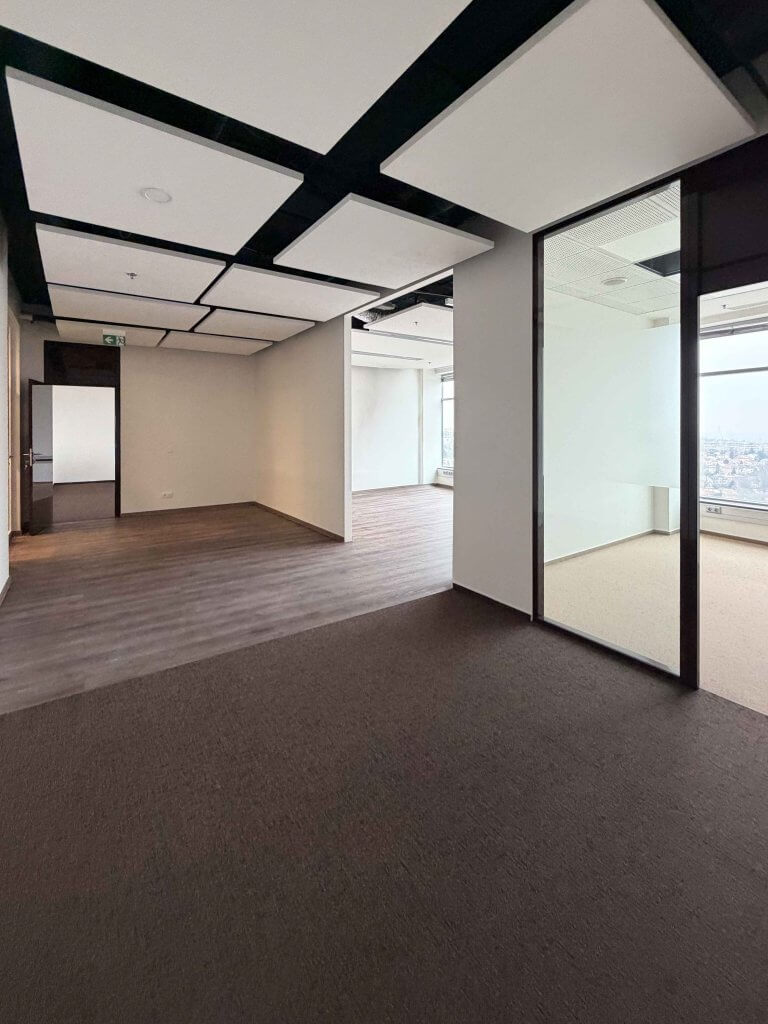
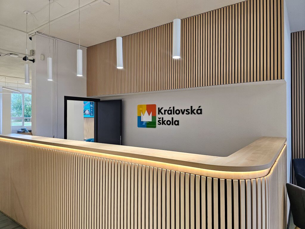
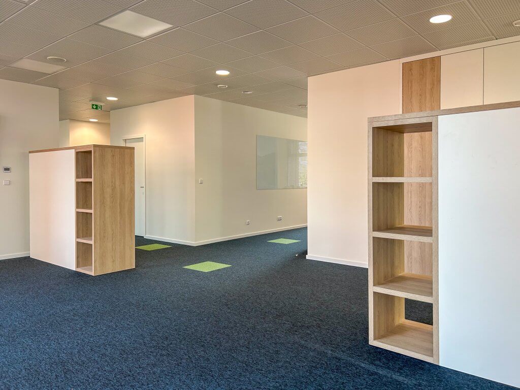
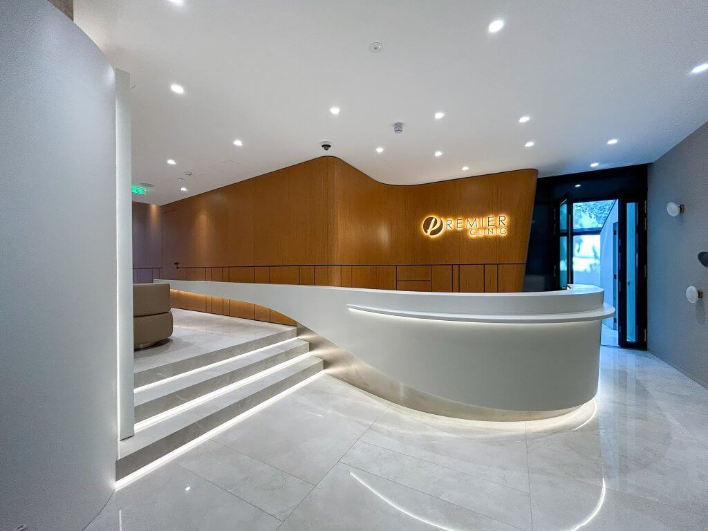
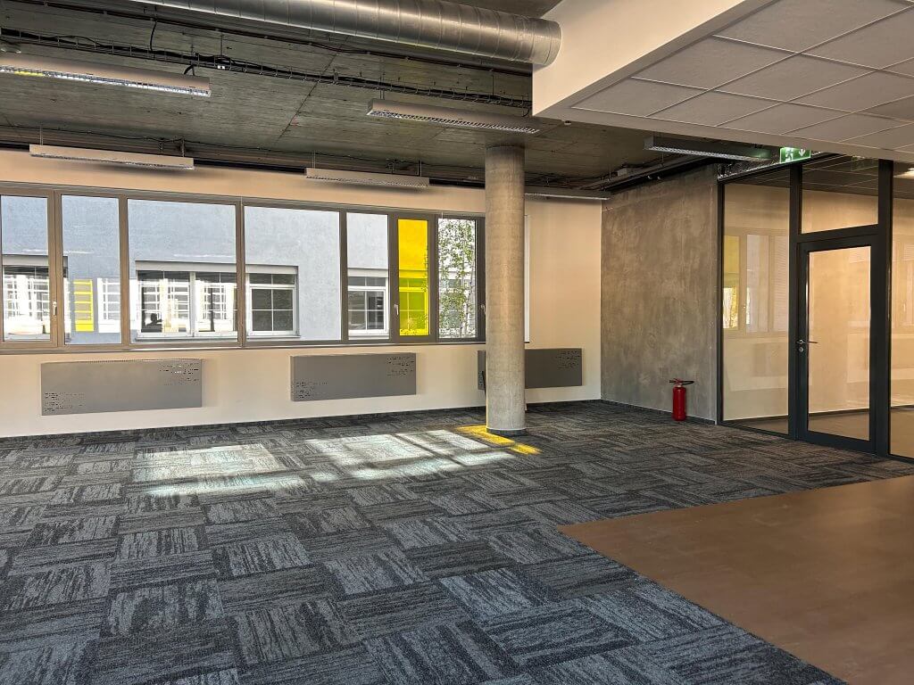
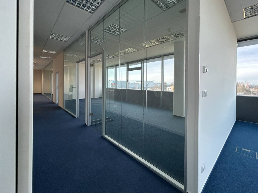
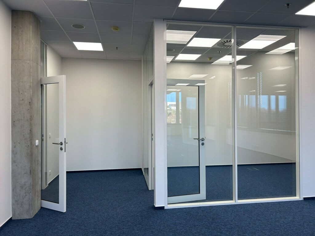
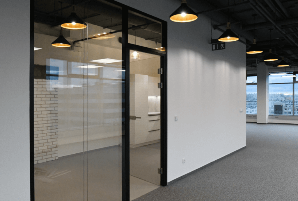
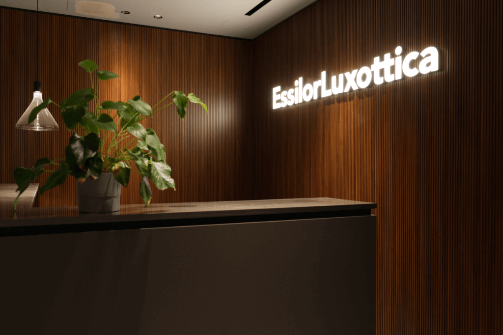
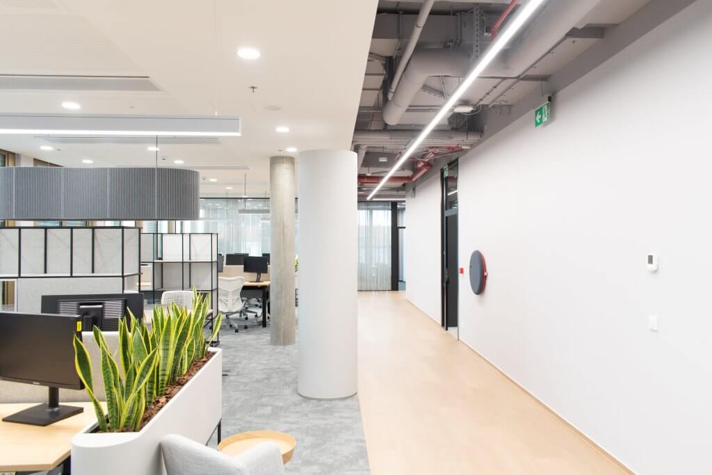
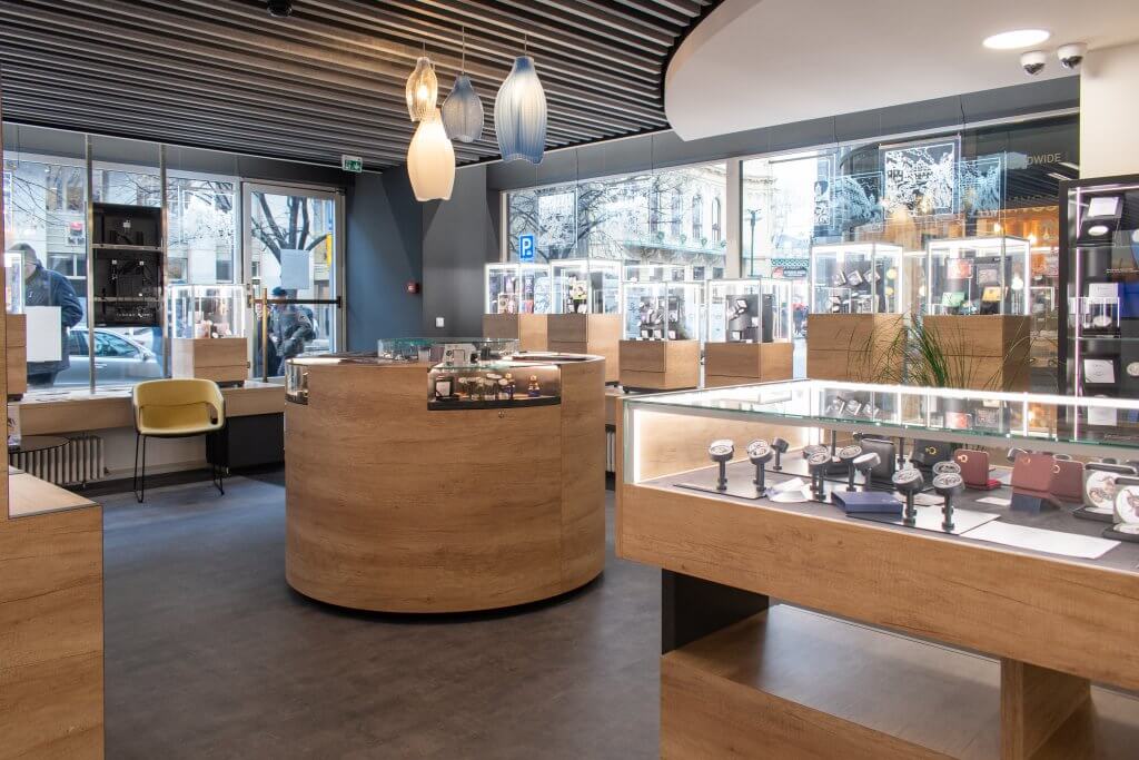
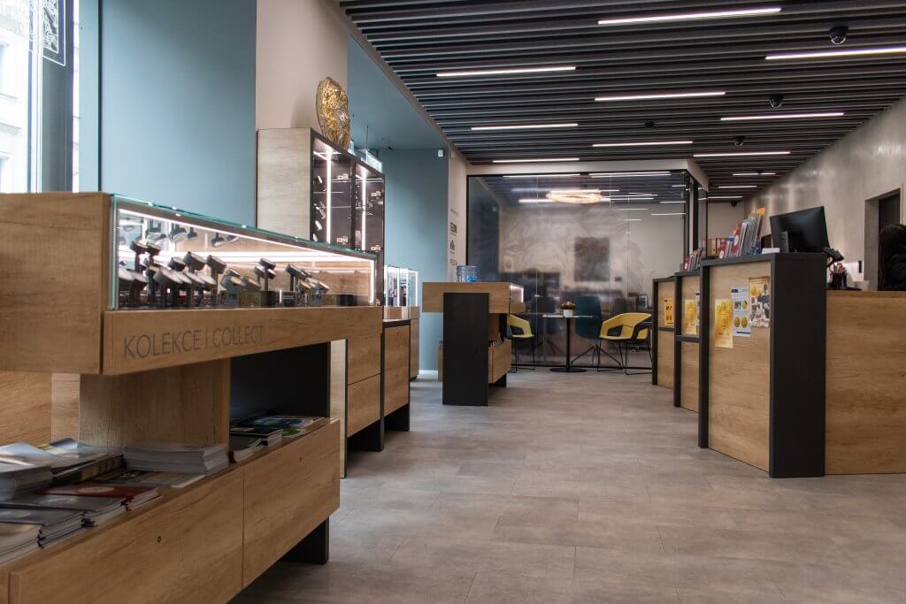
The revitalization of the Shell offices began with our new space plan blueprint, which is basically a document that details the division of all of the important elements in the given interior. Then we had to start working on remaking the old office to accommodate this brand new space plan and changing most of the main visual parts of the interior. For example, we changed the carpet, painted all of the walls (some of them with a magnetic paint that people can write on) and created a whole new reception. After our reconstruction, the office was entirely transformed into a new modern looking space with natural elements.
The acoustic tranquillity
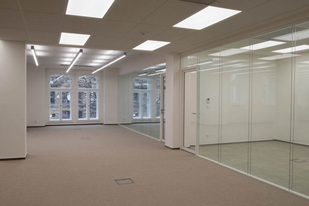
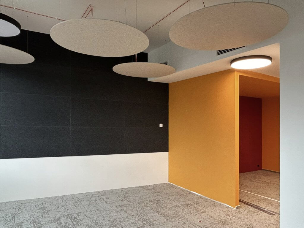
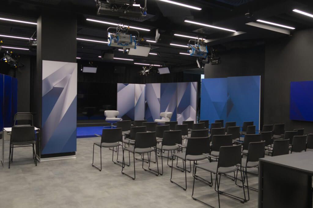
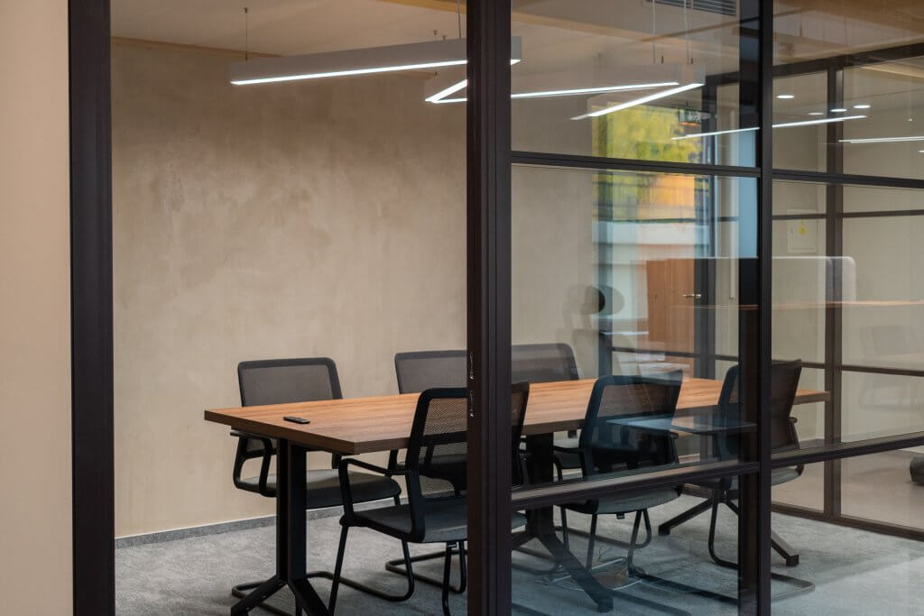
Peace and calm for work is extremely important for the office workers. That is why we often introduce various acoustic solutions in our projects. These are designed to provide peaceful environment and deal with the surrounding noise. In the Shell offices we installed acoustic panels from the famous Lithuanian furniture company Narbutas. These panels absorb all of the building noise and create a quieter interior. Besides the acoustic panels we also exchanged the stackable partition in the conference room for 2 smaller ones. The former partition did not provide the correct properties anymore and the new partitions not only work better, but also add superior acoustics as well as nicer visual design.
The company colours in harmony with decorative elements
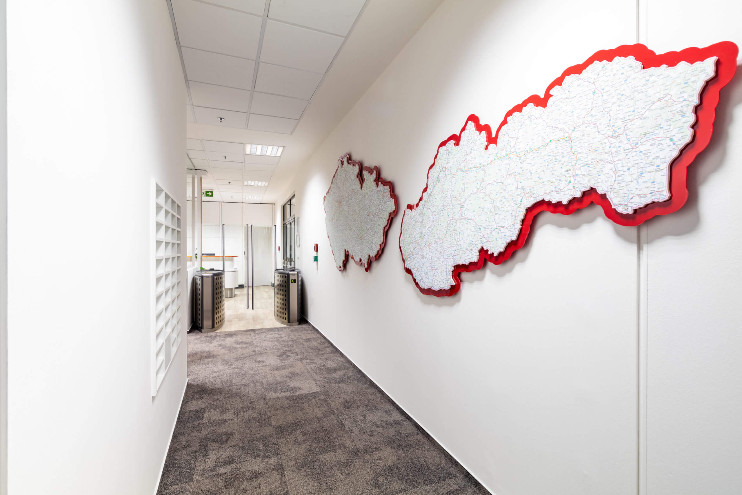
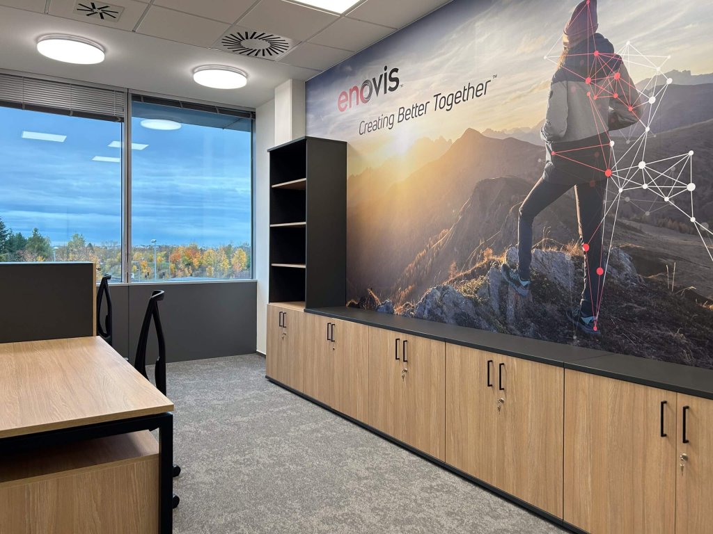
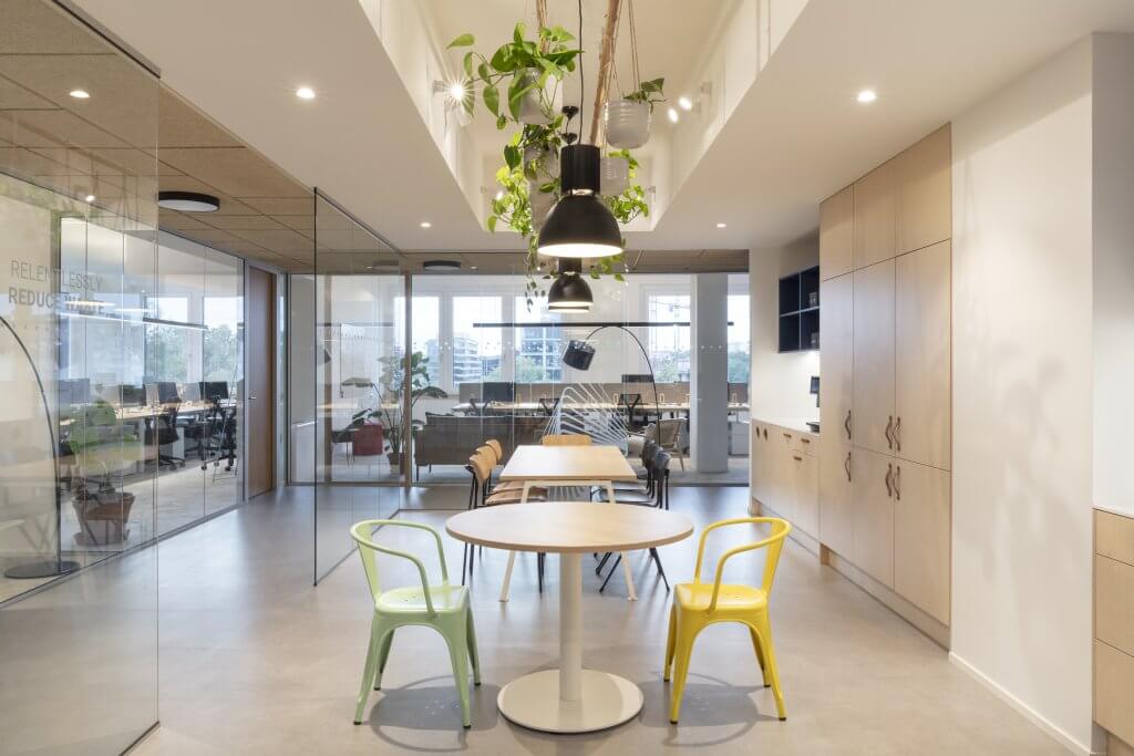
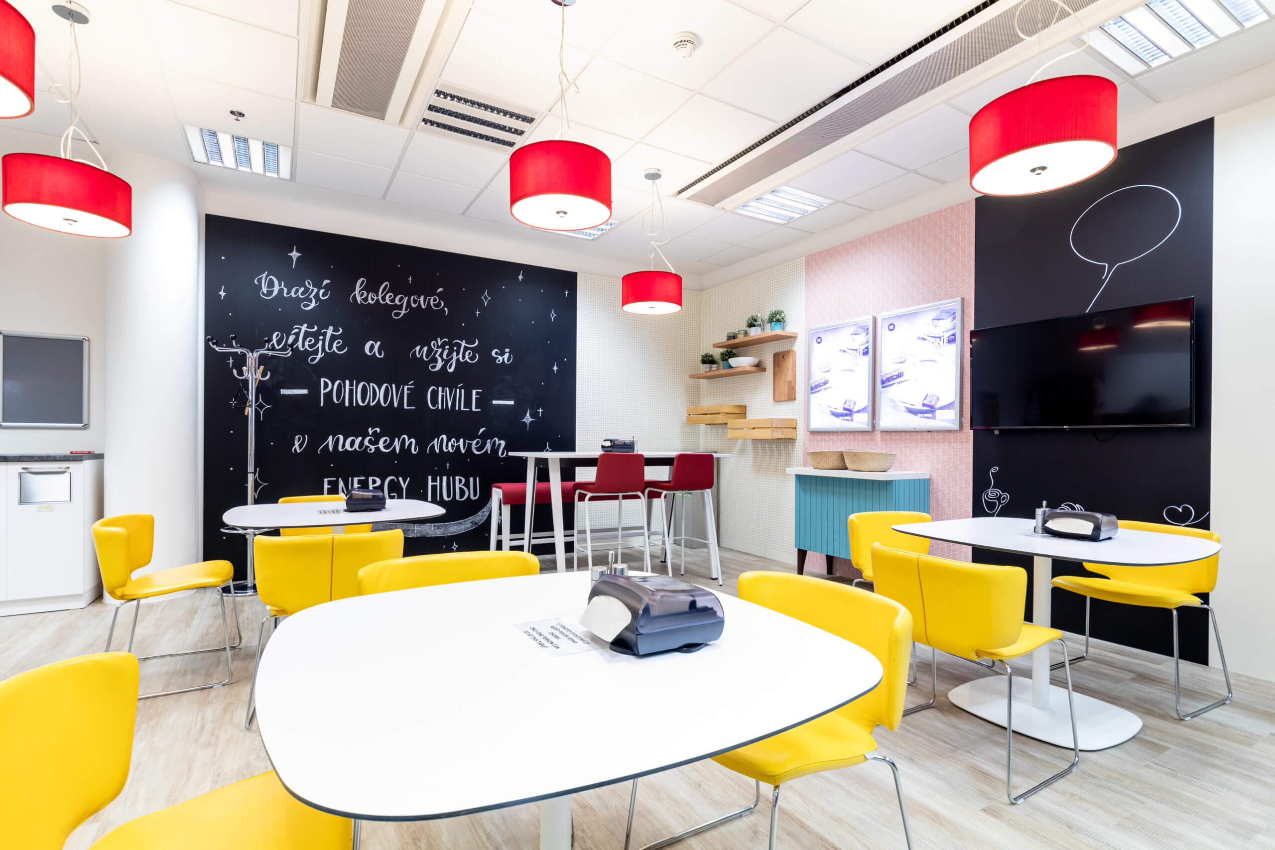
Shell is a gigantic global company and that is why it is necessary to adhere to strict rules across all of the branches in the world. These rules regulate the possible colour schemes, used materials, furniture or even ergonomics. This is why we had to incorporate the company colours (red and yellow) into the newly designed space. However, the specific shades can be very intense, even disruptive. So, we used them sparingly as complementary colours. The main parts of the colour scheme were instead elegant wooden tones along with gentle white. The biggest impact of these colours can be seen in the reception.
The greenery as a beautiful, yet practical element
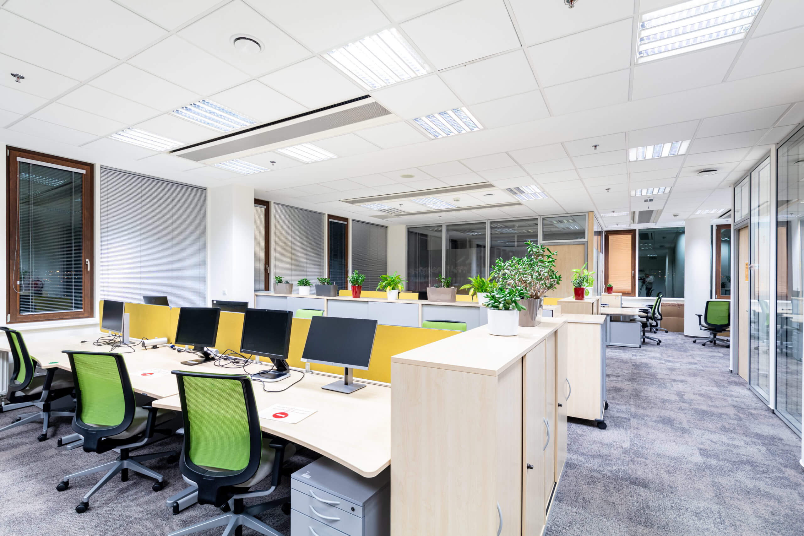
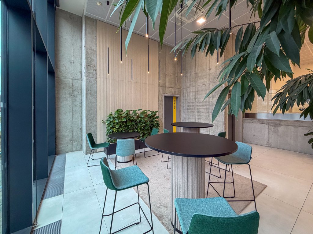
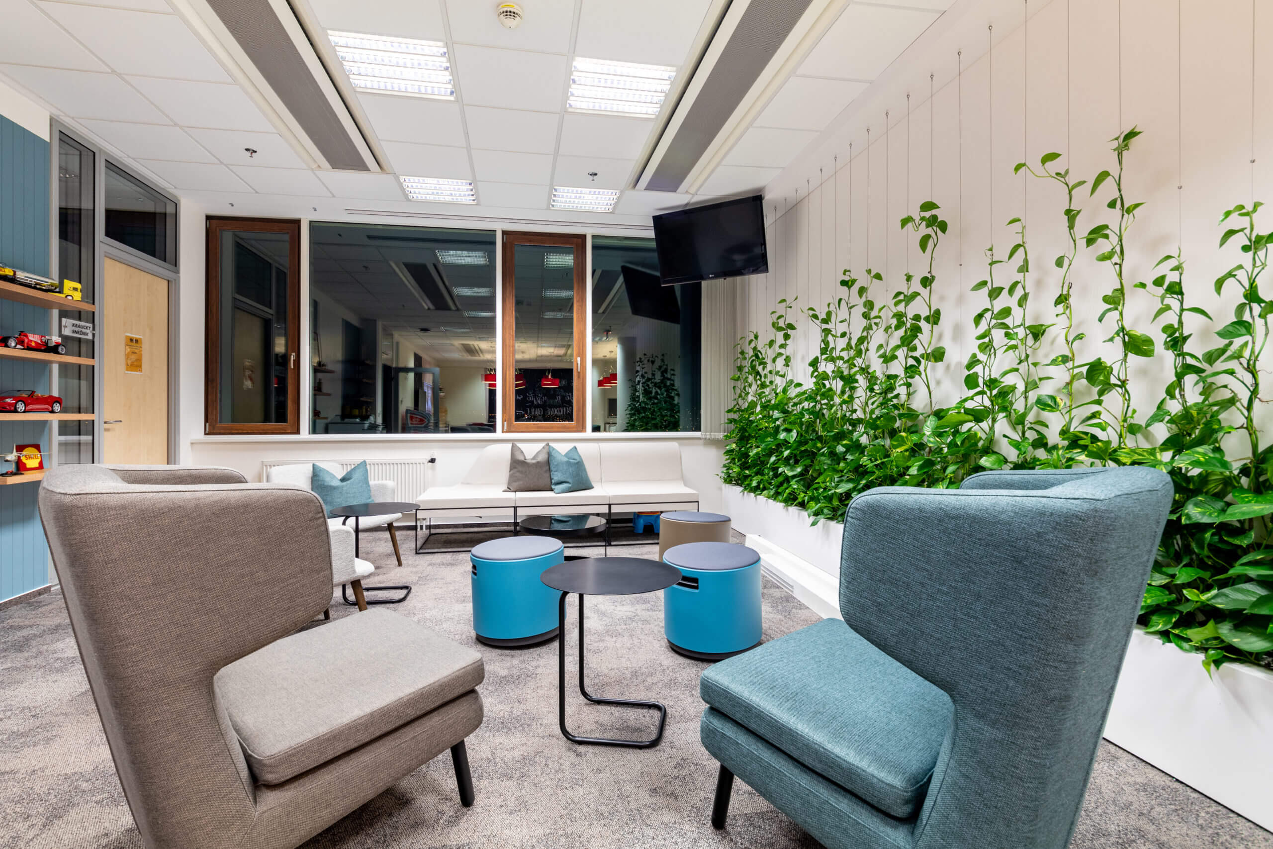
The presence of plants in the office helps to create a visually more light, airy space. Plants also provide a nice contrast to the modern technological elements. For these reasons we put greenery into the reception and the so-called energy hub (the office kitchen with a relaxation zone). In the reception, the green walls serve as a unique barrier between the entrance and the office space.
The client had quite a clear vision from the start as well as strict corporate rules that we had to adhere to. This however did not impede our creativity, which is reflected in the finalized office space. The offices have a very pleasant and modern vibe. Both the employees and the management were highly satisfied with the end result of the project.


