Futurama Business Park OM Consulting offices
Design sprint
OM Consulting has been our long-term partner for more than 4 years. We constructed their previous offices in the Palace Karlín for them. Thanks to the trust gained, the client thus turned to us with an urgent request – to design a brand-new office space as soon as possible and then also implement it. Over the next 2 months, we worked intensely on a design that included all of the client requirements. Our design reflects everything important, from the layout of the interior to the joinery elements and the colour scheme of the rooms.
A whole new face of the office
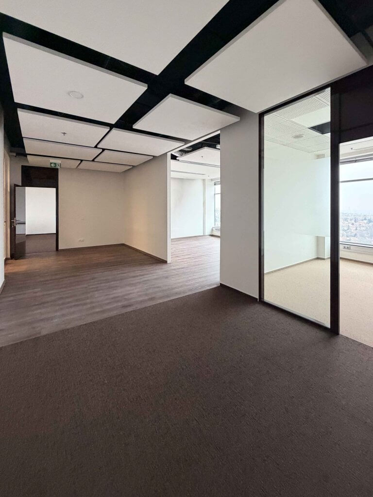
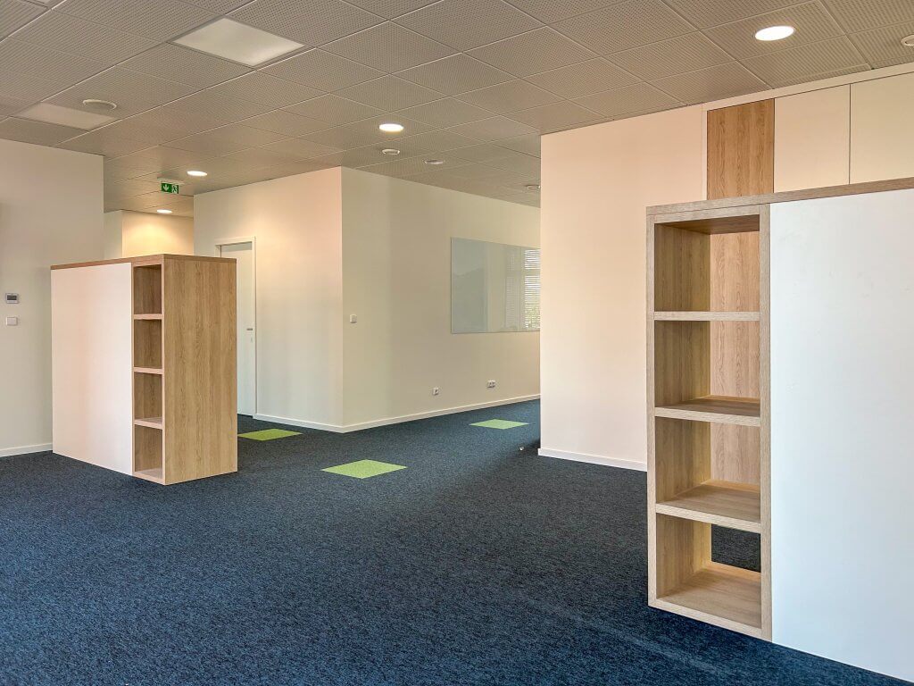
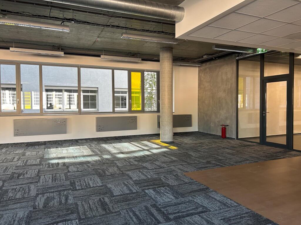
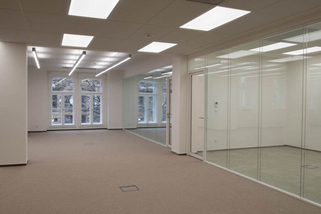
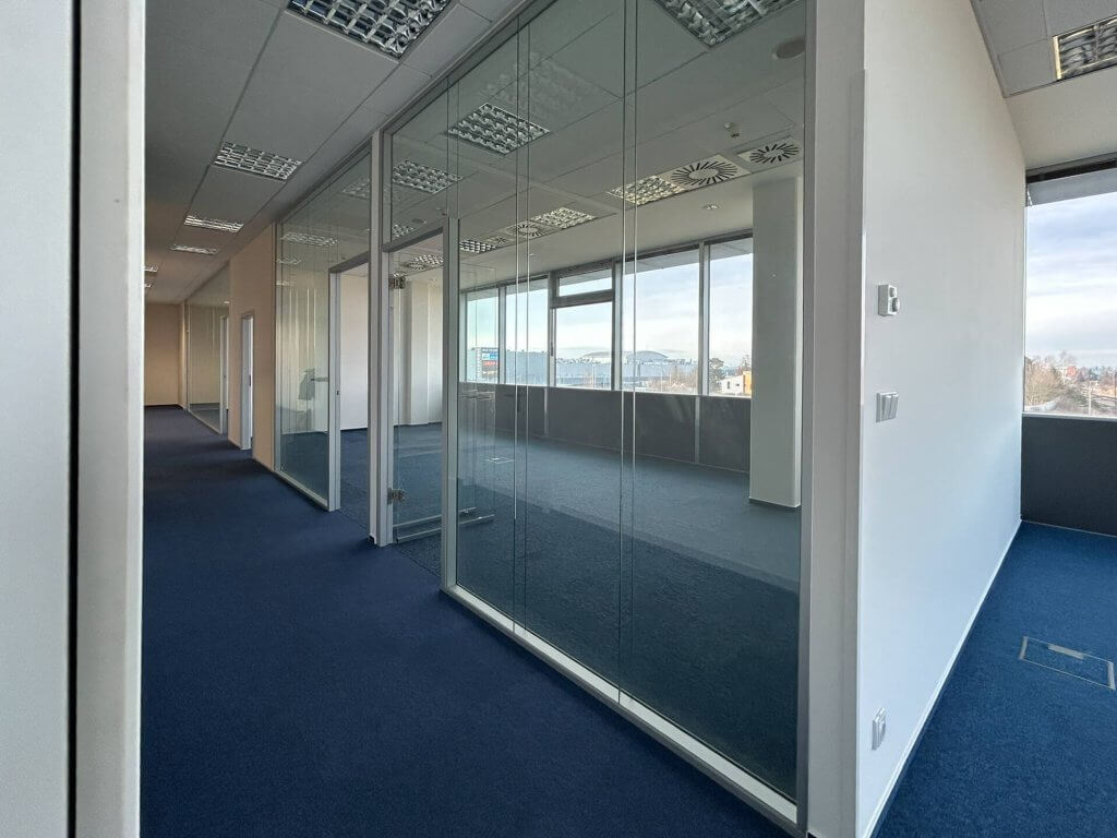
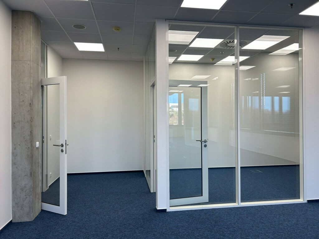
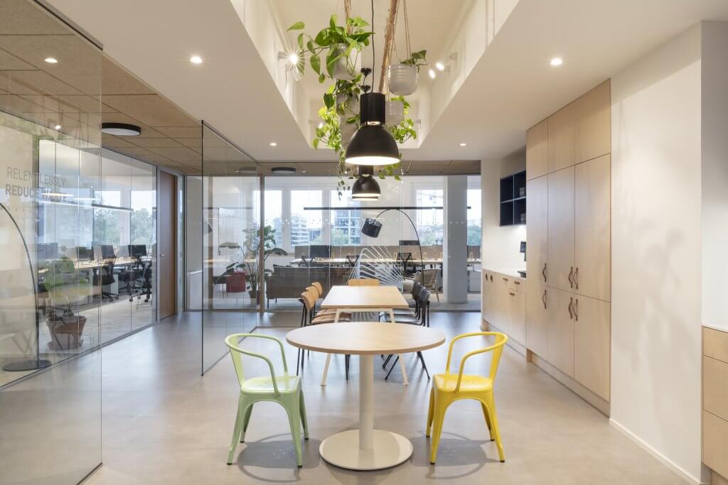
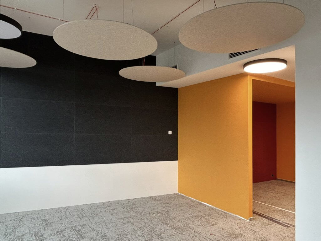
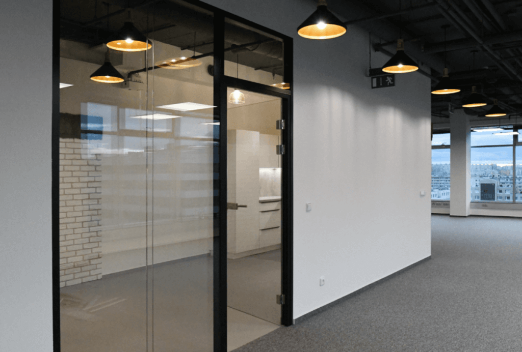
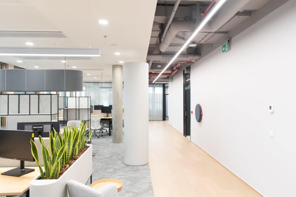
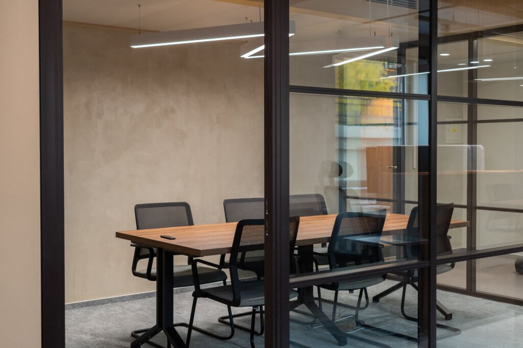
The original tenant would most definitely not be able to recognize the space after we started working on it, even after just a few days of construction. Virtually all corners were demolished, except for the existing kitchen. Then we redesigned the interior space division by building plasterboard partitions. This was followed by electrical installations, including new lighting, and then all the work that adjusted the appearance of the office according to our plans. Among other things, we installed ceiling soffits, hung acoustic panels, sprayed the ceilings and laid carpets. In short, there has been a complete transformation.
Serious but friendly atmosphere
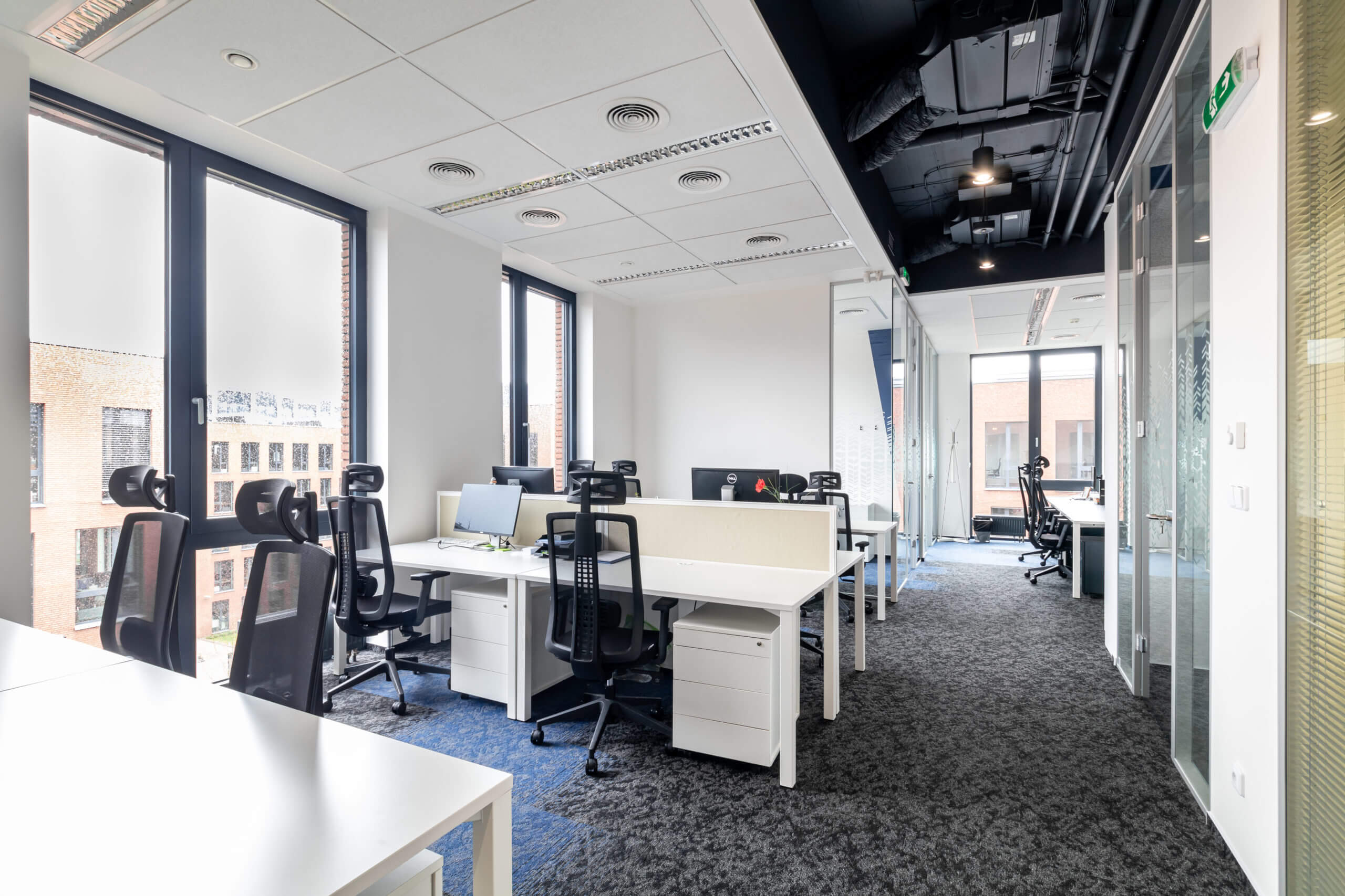
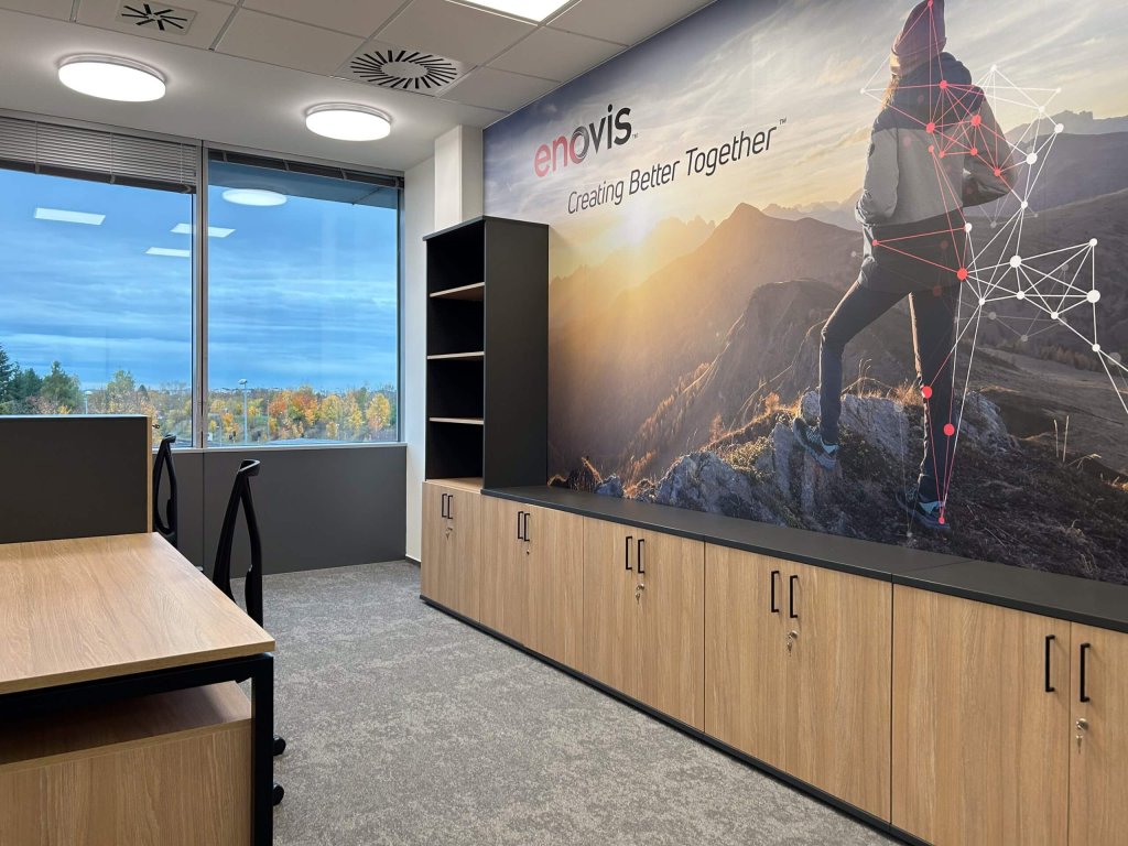
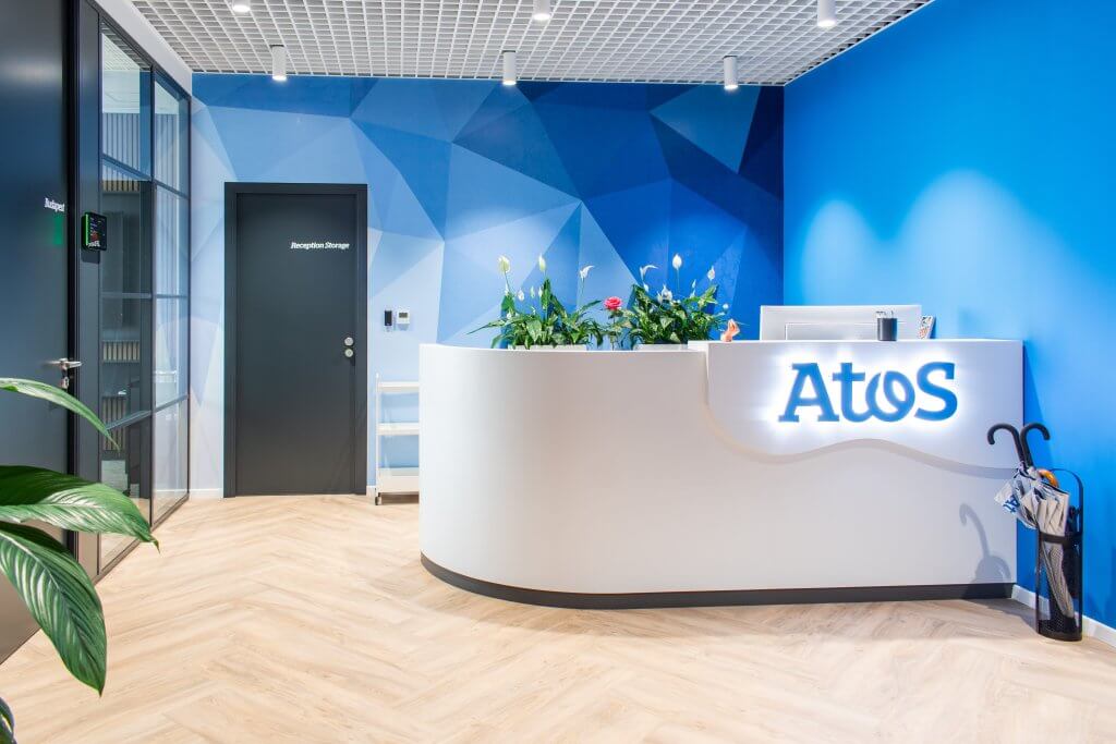
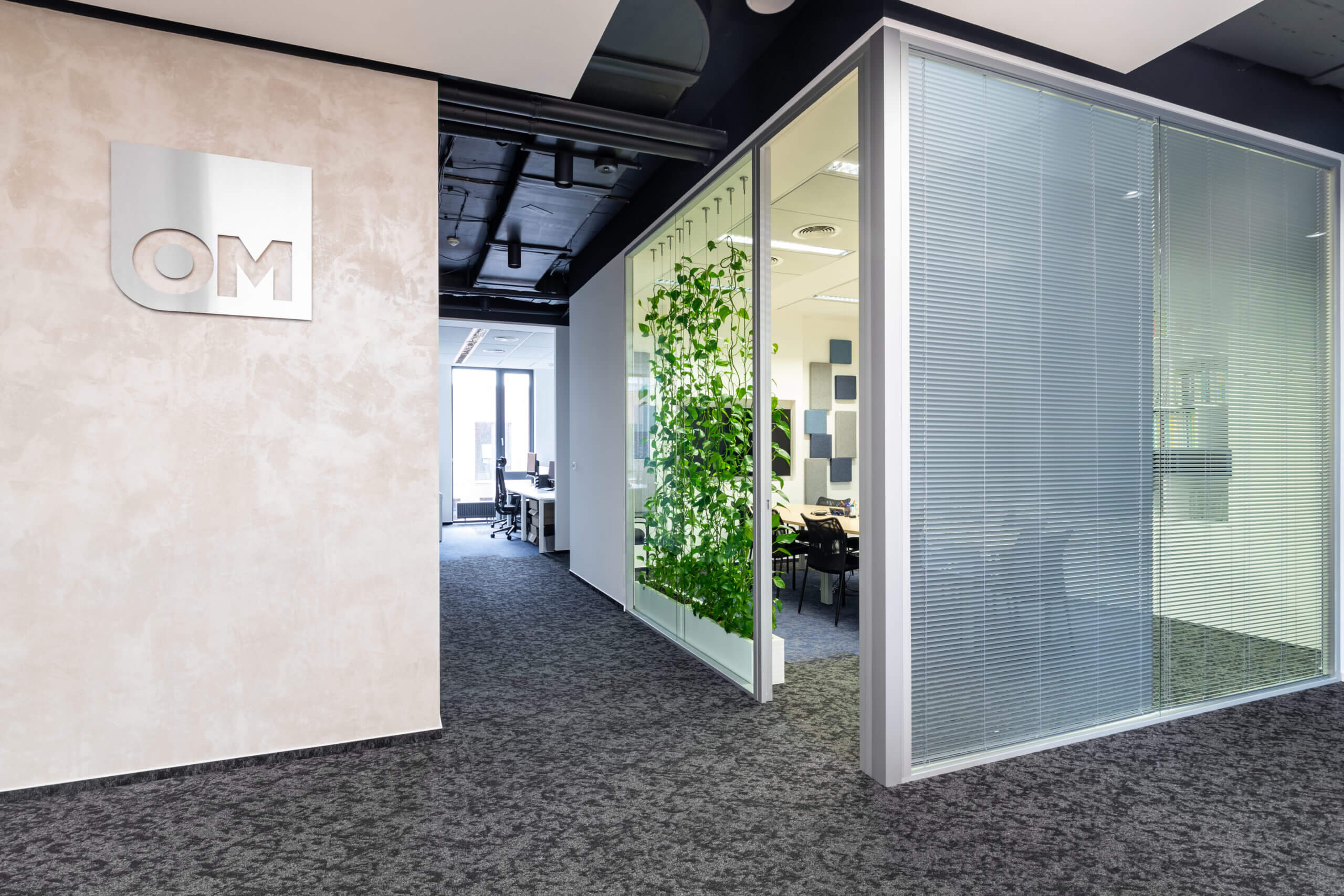
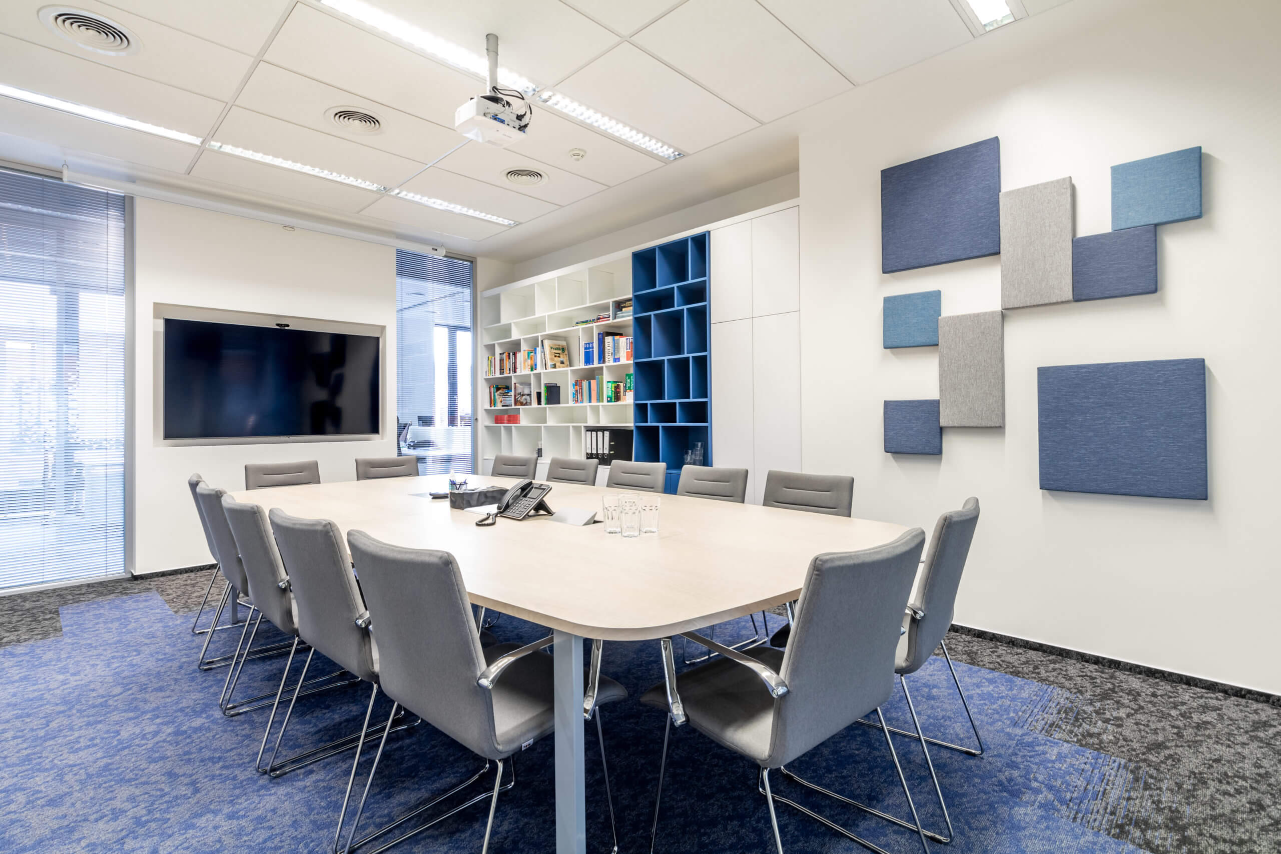
The client's goal was for the offices to correspond to their corporate culture, which is friendly but at the same time takes every customer and their needs extremely seriously. We achieved the desired effect by significantly involving corporate colours in the interior. The whole space is dominated by the blue colour from the OM Consulting logo, which decorates part of the wall painting, furniture and carpets. In addition, we have added a repeating visual element in the form of blue triangles on the walls, which are visible through the glass partitions and together form a regular blue grid.
The reception must stand out
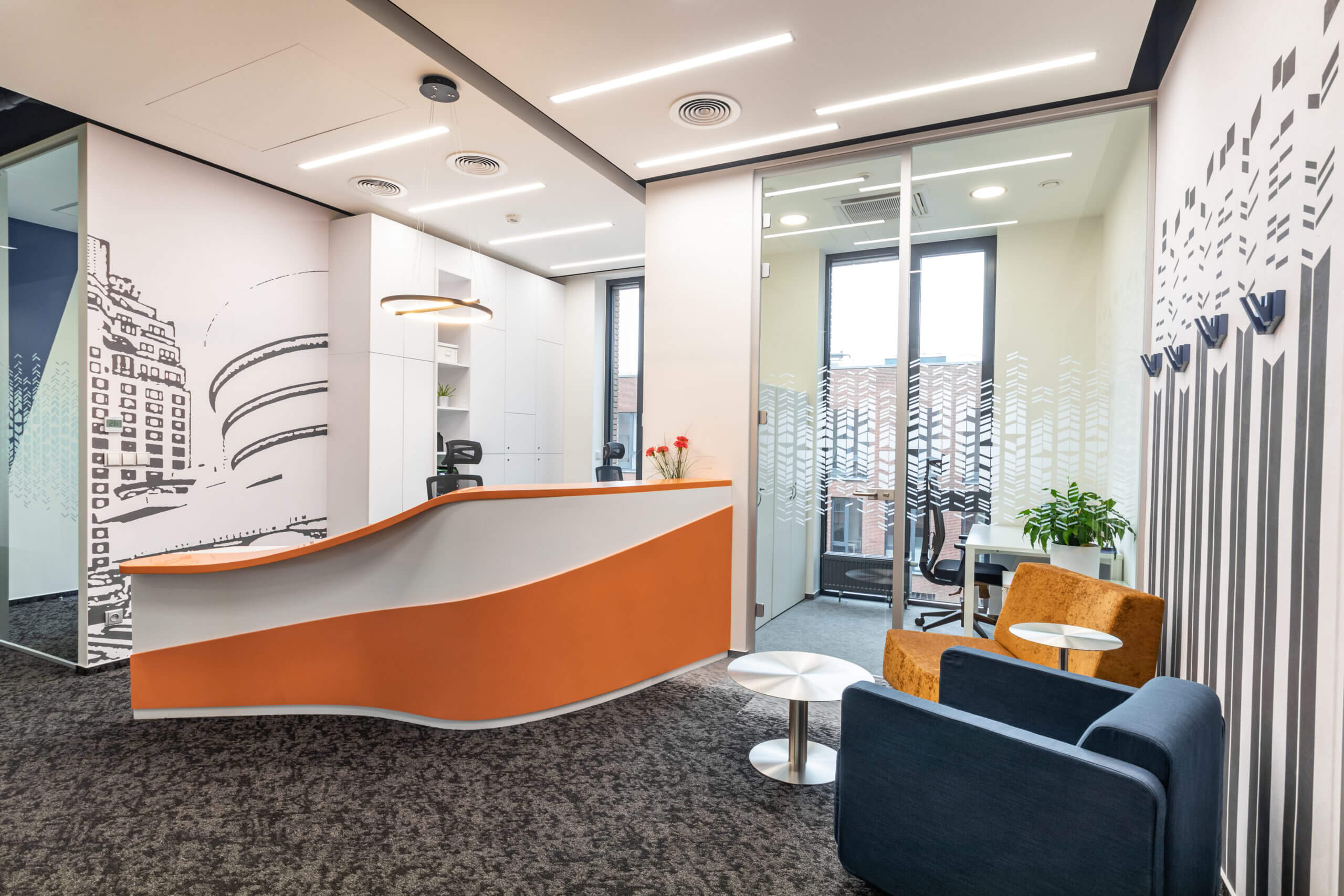
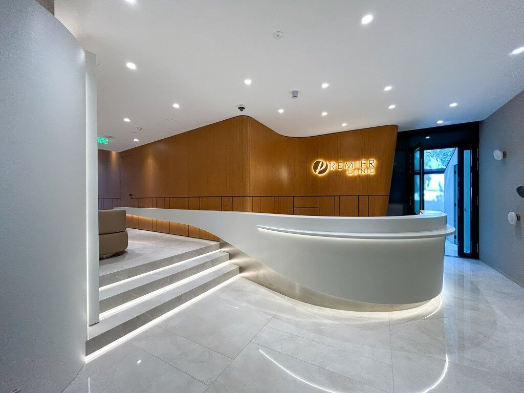
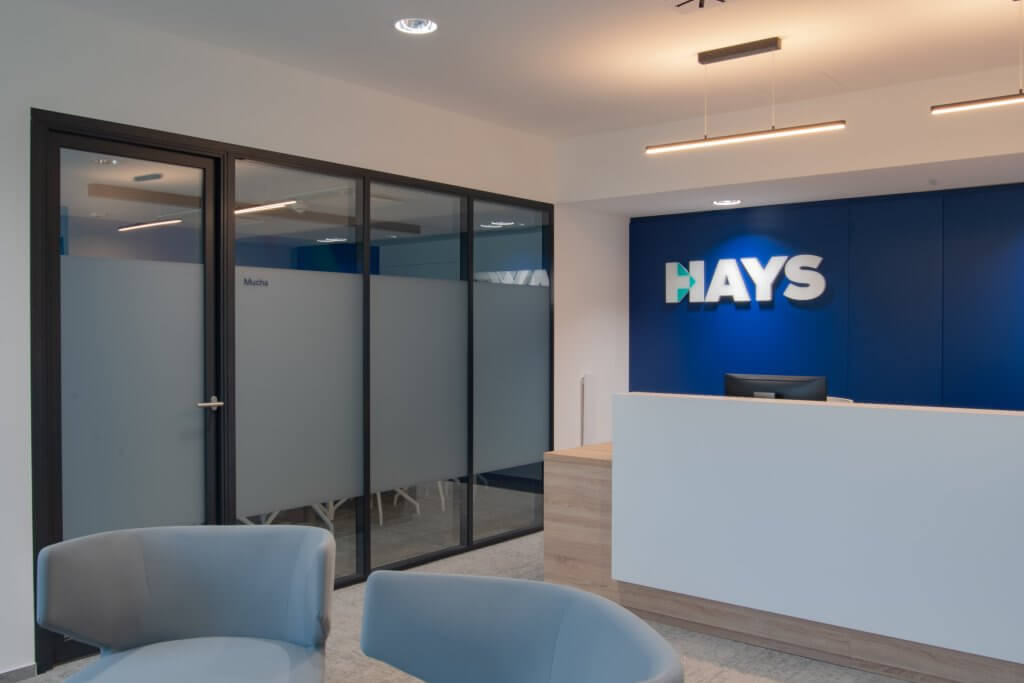
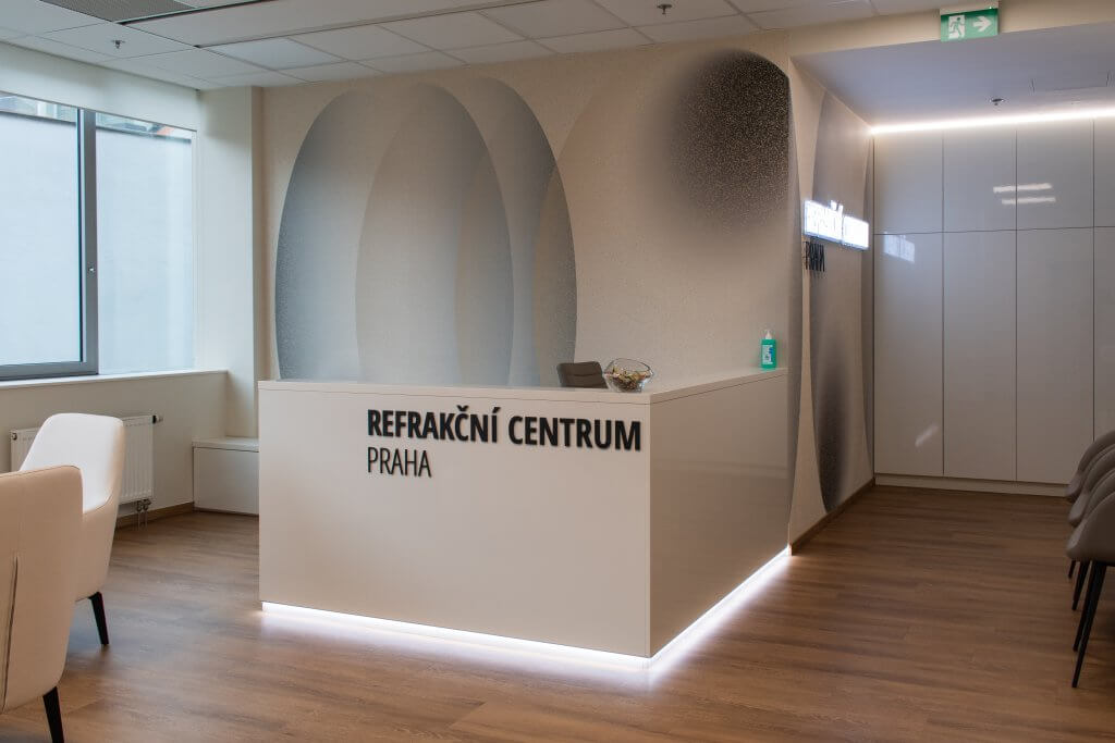
We have disrupted the blue colour scheme only at the reception, which is a key orientation point for visitors and must not blend in with the surroundings. As a contrast to the blue, we chose the colour orange in combination with white. This colour combination appears both on the corian reception desk and on the upholstery of the reception chair as well as on some of the carpentry elements. Thanks to the colour design of the furniture, the reception immediately attracts the eyes of everyone who enters the office, but does not visually clash in an unpleasant way with the rest of the office.
The client was very satisfied with our work and we are glad that we were able to include the design and implementation of these beautiful spaces in our portfolio.


